ShopDreamUp AI ArtDreamUp
Deviation Actions


![[Custom box code] Wide content](https://images-wixmp-ed30a86b8c4ca887773594c2.wixmp.com/f/f9d3f707-badf-4eba-a9f9-7e67baae16d6/d8jz7o9-7c0976bc-b48f-4ff0-beaf-c7328255f119.png/v1/crop/w_184,h_184,x_127,y_0,scl_0.27380952380952,q_70,strp/_custom_box_code__wide_content_by_valognir_d8jz7o9-92s-2x.jpg?token=eyJ0eXAiOiJKV1QiLCJhbGciOiJIUzI1NiJ9.eyJzdWIiOiJ1cm46YXBwOjdlMGQxODg5ODIyNjQzNzNhNWYwZDQxNWVhMGQyNmUwIiwiaXNzIjoidXJuOmFwcDo3ZTBkMTg4OTgyMjY0MzczYTVmMGQ0MTVlYTBkMjZlMCIsIm9iaiI6W1t7ImhlaWdodCI6Ijw9NjcyIiwicGF0aCI6IlwvZlwvZjlkM2Y3MDctYmFkZi00ZWJhLWE5ZjktN2U2N2JhYWUxNmQ2XC9kOGp6N285LTdjMDk3NmJjLWI0OGYtNGZmMC1iZWFmLWM3MzI4MjU1ZjExOS5wbmciLCJ3aWR0aCI6Ijw9MjUyNCJ9XV0sImF1ZCI6WyJ1cm46c2VydmljZTppbWFnZS5vcGVyYXRpb25zIl19.OJoggzl-pbzxihsT4bYchXfeROiuu0TYHhzNKEeaRZA)
![[Custom box code] Wide content](https://images-wixmp-ed30a86b8c4ca887773594c2.wixmp.com/f/f9d3f707-badf-4eba-a9f9-7e67baae16d6/d8jz7o9-7c0976bc-b48f-4ff0-beaf-c7328255f119.png/v1/crop/w_92,h_92,x_63,y_0,scl_0.13690476190476,q_70,strp/_custom_box_code__wide_content_by_valognir_d8jz7o9-92s.jpg?token=eyJ0eXAiOiJKV1QiLCJhbGciOiJIUzI1NiJ9.eyJzdWIiOiJ1cm46YXBwOjdlMGQxODg5ODIyNjQzNzNhNWYwZDQxNWVhMGQyNmUwIiwiaXNzIjoidXJuOmFwcDo3ZTBkMTg4OTgyMjY0MzczYTVmMGQ0MTVlYTBkMjZlMCIsIm9iaiI6W1t7ImhlaWdodCI6Ijw9NjcyIiwicGF0aCI6IlwvZlwvZjlkM2Y3MDctYmFkZi00ZWJhLWE5ZjktN2U2N2JhYWUxNmQ2XC9kOGp6N285LTdjMDk3NmJjLWI0OGYtNGZmMC1iZWFmLWM3MzI4MjU1ZjExOS5wbmciLCJ3aWR0aCI6Ijw9MjUyNCJ9XV0sImF1ZCI6WyJ1cm46c2VydmljZTppbWFnZS5vcGVyYXRpb25zIl19.OJoggzl-pbzxihsT4bYchXfeROiuu0TYHhzNKEeaRZA)


Description
Just another simple journal, really struggling for inspiration for a really complex one, but I'll get it sooner or later. ")
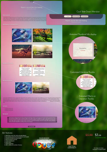
Took quite a while to get this coded properly but I'm pretty pleased with the results. I have only check the compatibility with Firefox and IE, so if anyone could let me know if it works in the other browsers I would I really appreciate it.
At first this was going to be as complex as my last when it came to the coding but I got so many people asking for help I thought I better keep it simple this time so I have. There are only 4 things that need or can be added.
---------
 Live Version : [link]
---------
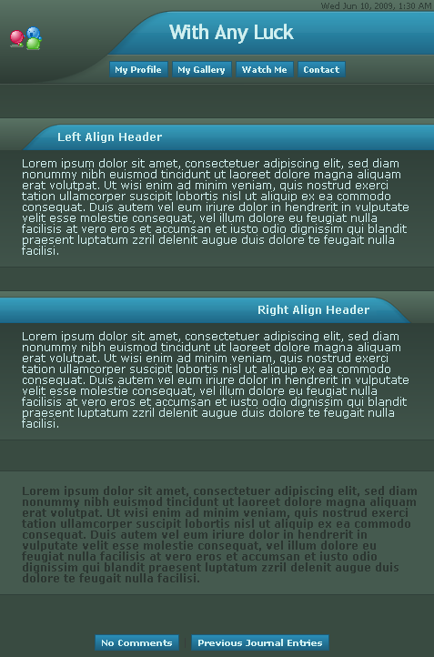
 Left aligned header
<div class="leftheader">YOUR TEXT HERE</div>
Right aligned header
<div class="rightheader">YOUR TEXT HERE</div>
Text box under the header
<div class="textbox">YOUR TEXT HERE</div>
Text box on it's own
<div class="sepbox">YOUR TEXT HERE</div>
There, see, didn't I say simple or what? But again if you want any help at all just give me a note and I'd be happy to help.
All links at the top should change automatically when you install the skin (fingers crossed) but if they don't feel free to change them. And the same goes for the dev icon in the top left hand corner, that should automatically change to yours.
Hope you guys like, and enjoy.
I give *CSS-Babes and =journalskins full permission to place this in their gallery.
Took quite a while to get this coded properly but I'm pretty pleased with the results. I have only check the compatibility with Firefox and IE, so if anyone could let me know if it works in the other browsers I would I really appreciate it.
At first this was going to be as complex as my last when it came to the coding but I got so many people asking for help I thought I better keep it simple this time so I have. There are only 4 things that need or can be added.
---------
---------
<div class="leftheader">YOUR TEXT HERE</div>
<div class="rightheader">YOUR TEXT HERE</div>
<div class="textbox">YOUR TEXT HERE</div>
<div class="sepbox">YOUR TEXT HERE</div>
There, see, didn't I say simple or what? But again if you want any help at all just give me a note and I'd be happy to help.
All links at the top should change automatically when you install the skin (fingers crossed) but if they don't feel free to change them. And the same goes for the dev icon in the top left hand corner, that should automatically change to yours.
Hope you guys like, and enjoy.
I give *CSS-Babes and =journalskins full permission to place this in their gallery.
© 2009 - 2024 LifesDestiny
Comments18
Join the community to add your comment. Already a deviant? Log In
What is the code you used for your top section of links? i can't figure out how to center them and the align: center dose not work for me. I have:
.links1 {
color:#ffffff;
background:url([link]);
position:relative;
top:-10px;
float:left;
font-size:15px;
font-weight:bold;
height:61px;
width:56px;
line-height:80px;
text-align:center;
margin: 0px auto;
font-family: Courier New; }
.links1:hover {
color:#00ff00;}
.links1 {
color:#ffffff;
background:url([link]);
position:relative;
top:-10px;
float:left;
font-size:15px;
font-weight:bold;
height:61px;
width:56px;
line-height:80px;
text-align:center;
margin: 0px auto;
font-family: Courier New; }
.links1:hover {
color:#00ff00;}